|
Symposium Display Board Tips |
||||
|
Designing Your Display Board: Where to Begin?
|
||||
|
||||
|
Tri-Fold Display Boards
|
||||
|
Creek Connections provides the typical tri-fold display boards most Many students choose to lay out their display board using the typical science fair approach. Students often present the purpose, abstract, hypothesis, research methods, results, and conclusion. A few example layouts are shown below. |
||||
|
Such a layout is NOT mandatory, but it oftentimes helps students who may feel overwhelmed with the task of fitting all their information onto a single display board. Feel free to create your own design lay out and explanatory categories.
|
||||
Display Board Tips
|
Exhibit Tips |
|||
|
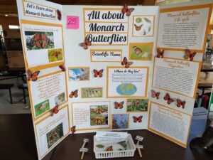
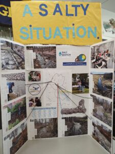
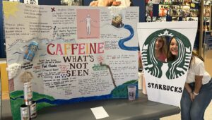
Things to Remember: 1. Do not try to crowd too much information on your poster 2. Focus on only a few main points 3. Create simplified charts, graphs, and diagrams 4. Make key points clear by using a figure, table, or photograph 5. Vary the shape and size of visual elements 6. Use text simply and sparingly in a readable font 7. Create an element that will attract viewers from a distance 8. Make your message clear and simple by using big ideas, big type, Check Out This Display! Interactive Displays are Fun!
> Try creating a game for your project |
||||
|
Display Board “Do’s and Don’ts” |
||||
|
Don’ts 1. Use an over-long title 2. Use text that is too small 3. Separate complimentary ideas, pictures, charts, or graphs 4. Stand in front of your display |
Do’s 1. Keep your title short, snappy, and 2. Make sure all text can be read from a reasonable, comfortable distance 3. Lay out your information in a 4. Stay close by, but stand off to the side in case visitors have any questions |
|||


